Role

Product Designer

Client

SkyHive

Duration

4 months

Enterprise Structure in SkyHive
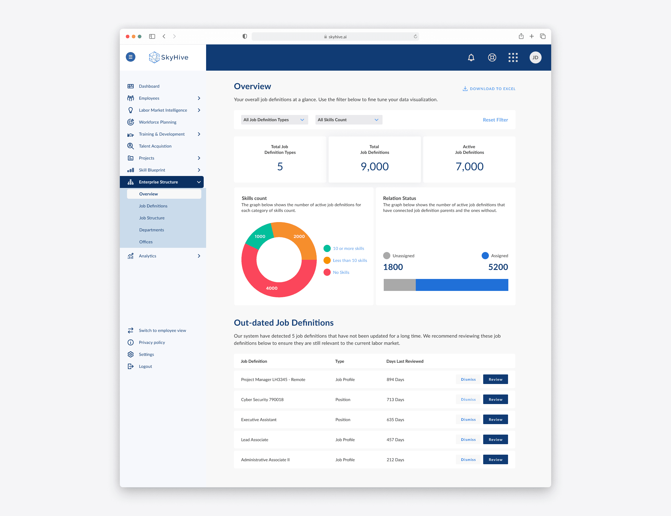
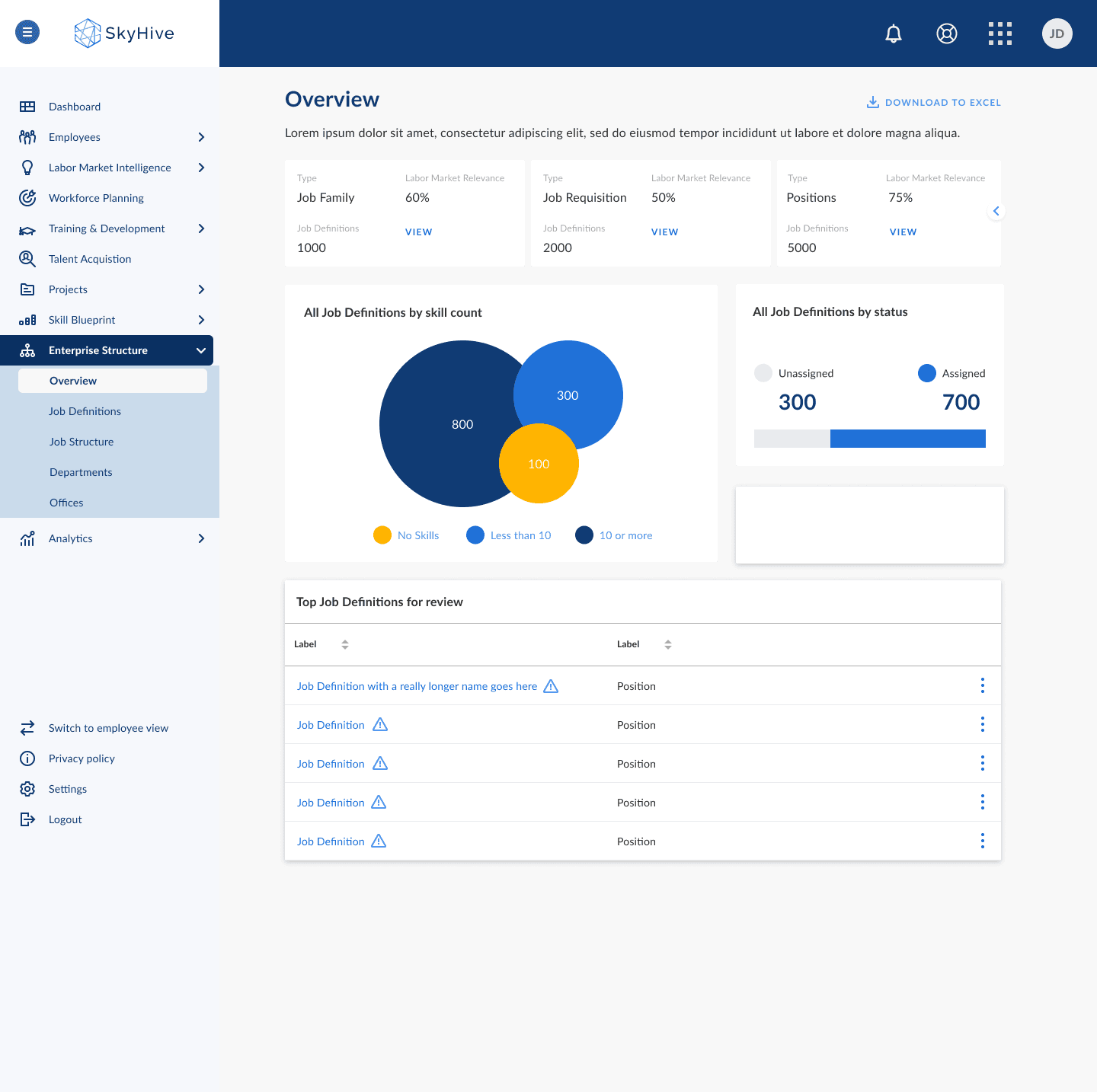
SkyHive dashboard with job totals, a skills count donut chart, assignment status, and outdated job definitions

Overview

Job Architecture began as a stand-alone application, designed to create job definitions or structures that prioritize skills and are free from bias through our automated solution.

It was aimed at helping organizations view and edit their job catalogs containing job profiles in which HR analysts and managers interface within their workflows (See the Job Architecture case study.)

I led the design and was the sole designer for this project, working with a product manager, a team of engineers, and QA.

Job Architecture began as a stand-alone application, designed to create job definitions or structures that prioritize skills and are free from bias through our automated solution.

It was aimed at helping organizations view and edit their job catalogs containing job profiles in which HR analysts and managers interface within their workflows (See the Job Architecture case study.)

I led the design and was the sole designer for this project, working with a product manager, a team of engineers, and QA.

Opportunity

  • We tested and learned that customers didn’t want independent products, but wanted integration with Workday.

  • We tested and learned that customers didn’t want independent products, but wanted integration with Workday.

Defining the problem

Before designing the Enterprise Structure dashboard, we needed to address key challenges around job definitions. Through research and stakeholder discussions, we identified critical questions that would shape our approach:


How might we flag or identify unattached job definitions?

Unattached job definitions lacked clear visibility, making it difficult for users to manage and structure job hierarchies efficiently.


How might we show job definitions that need review?

Organizations struggled to keep their job data relevant and aligned with market needs without a clear way to surface outdated job definitions.

How might we display the total number of job definitions within each type?

Users needed an intuitive way to gauge job distribution across different categories to make informed decisions about workforce planning.

By framing these challenges, we established a foundation for a design solution that would enhance visibility, streamline job review processes, and improve workforce data organization.

The goal

  • It needed to be built into the core product of the Enterprise.

  • It needed to be built into the core product of the Enterprise.

Initial exploration and wireframing
I worked alongside my product manager to identify areas of opportunity in the initial wireframing.

I worked alongside my product manager to identify areas of opportunity in the initial wireframing.

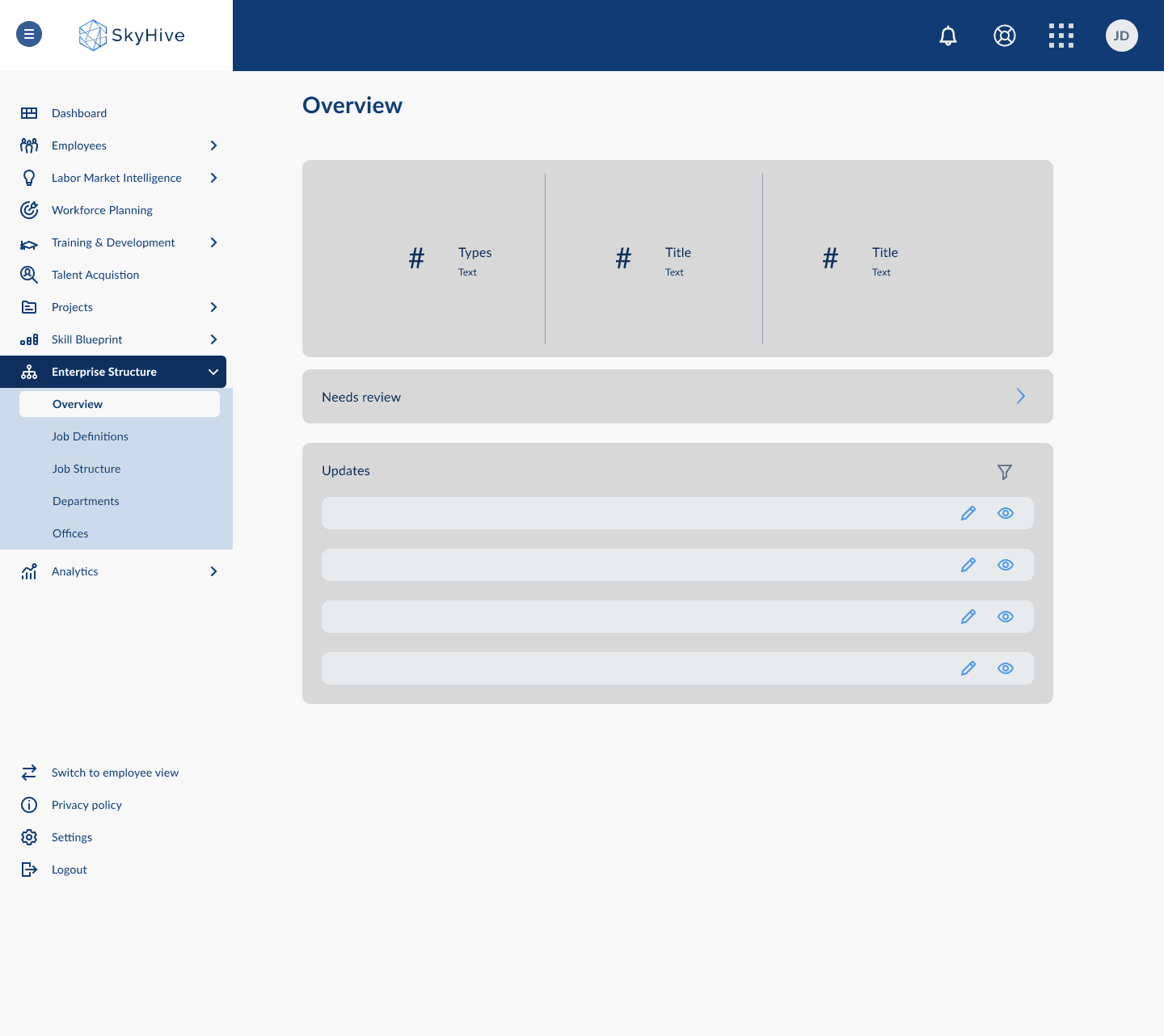
First dashboard wireframe with summary metrics, a Needs Review link, and an updates list
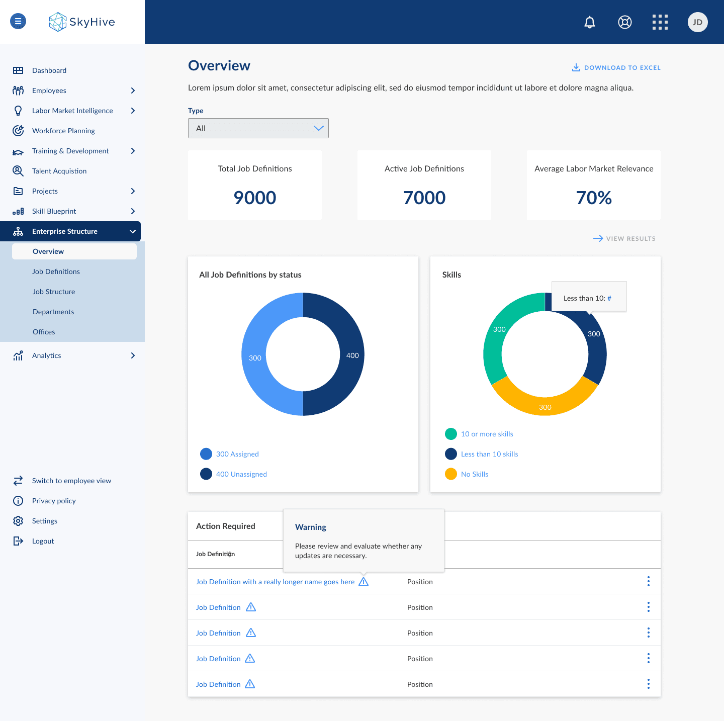
Dashboard concept with job totals, status and skills donut charts, and an action-required table with warnings
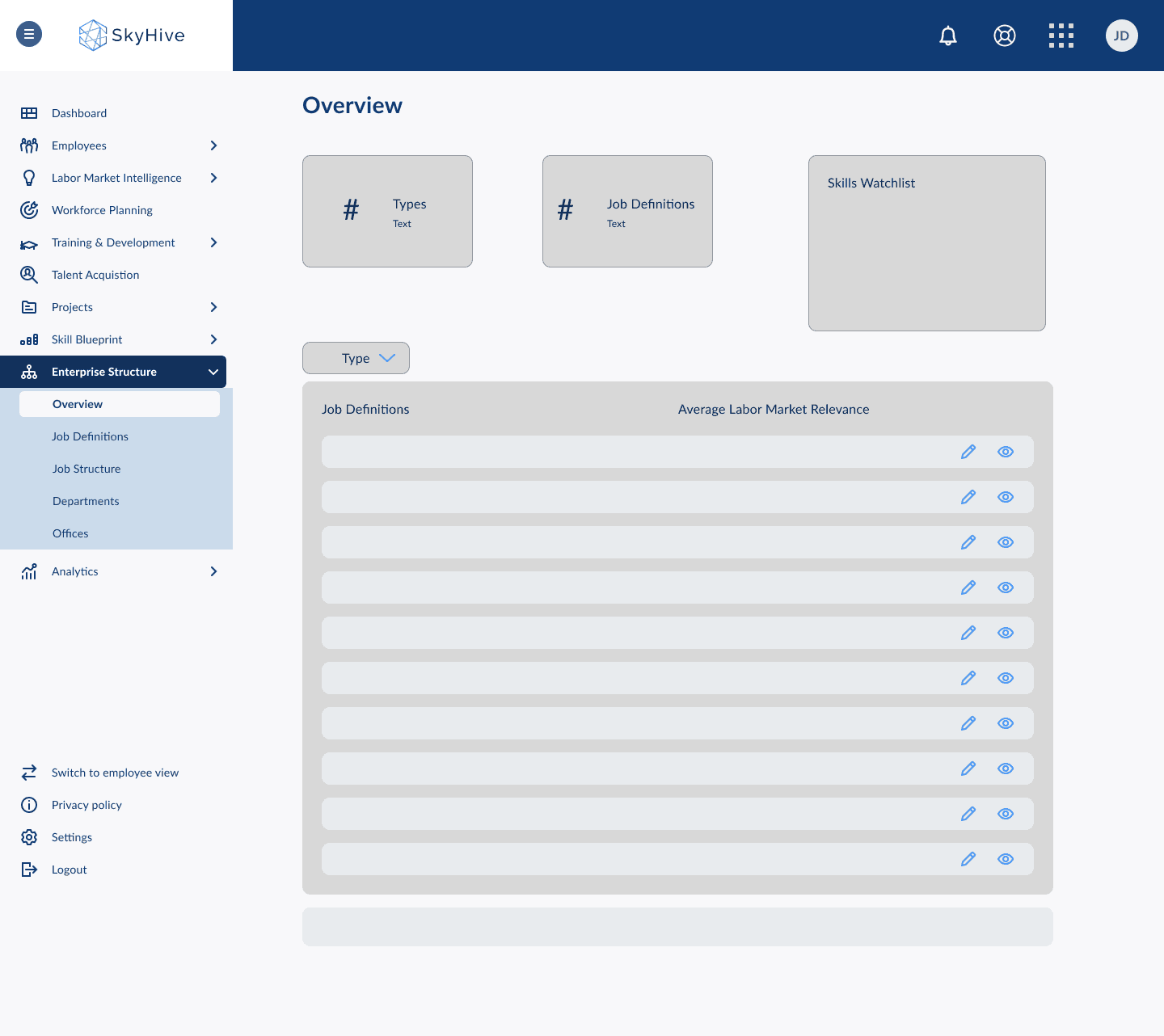
Second dashboard wireframe with job metrics, a skills watchlist, and a labor market relevance table
Dashboard concept with job type cards, a skills bubble chart, assignment status, and a job definitions review table
First dashboard wireframe with summary metrics, a Needs Review link, and an updates list
Second dashboard wireframe with job metrics, a skills watchlist, and a labor market relevance table
Dashboard concept with job totals, status and skills donut charts, and an action-required table with warnings
Dashboard concept with job type cards, a skills bubble chart, assignment status, and a job definitions review table

After establishing the initial wireframes, I moved into high-fidelity iterations, refining the visual hierarchy, interaction patterns, and data visualization to ensure clarity and usability. These iterations focused on:

  • Enhancing Data Visibility: Refining charts and statistics to provide at-a-glance insights for enterprise users.

  • Improving Actionability: Making outdated job definitions more prominent and ensuring clear call-to-actions for review.

  • Refining Filters & Navigation: Simplifying the filtering system to allow users to quickly drill down into relevant job data.


These iterations were closely aligned with stakeholder feedback and user needs, leading to the final design that was integrated into SkyHive’s enterprise product.

After establishing the initial wireframes, I moved into high-fidelity iterations, refining the visual hierarchy, interaction patterns, and data visualization to ensure clarity and usability. These iterations focused on:

  • Enhancing Data Visibility: Refining charts and statistics to provide at-a-glance insights for enterprise users.

  • Improving Actionability: Making outdated job definitions more prominent and ensuring clear call-to-actions for review.

  • Refining Filters & Navigation: Simplifying the filtering system to allow users to quickly drill down into relevant job data.


These iterations were closely aligned with stakeholder feedback and user needs, leading to the final design that was integrated into SkyHive’s enterprise product.

Animated SkyHive dashboard showing job filters, totals, skills distribution, assignment status, and review actions

Outcomes

The redesigned Enterprise Structure dashboard successfully streamlined job definition insights for SkyHive’s enterprise users.

  • The new design improved user engagement and efficiency by integrating data visualization, intuitive filters, and actionable insights.

  • The solution was ultimately folded into SkyHive’s leading enterprise product, reinforcing its value in workforce intelligence and organizational planning. This case study highlights how thoughtful UX and data-driven design can enhance decision-making in HR tech.

Key takeaways

Some key takeaways from this project:

  • The importance of information hierarchy in making large datasets digestible.

  • How to balance flexibility and consistency in dashboard design.

  • The value of iterative feedback to refine features that drive real user impact.

  • How to design for actionability, ensuring insights lead to meaningful decisions.

This project taught me valuable lessons about designing for enterprise users and handling complex data visualization.